Blog

What’s my ROI on lockdown?

When we make financial investments we tend to act completely selfishly. Even with ethical investments our aim is to make a return on the amount we put in. This article seeks to quantify lockdown as an ‘investment’ of pure self interest, variously for different age groups. Everyone has made sacrifices of their freedom and months of their lives to decrease the risk of death for everyone. But will our ‘return on investment‘ (ROI) be worth the price?

One of the key ways that regular economic investments are evaluated is the ‘expected value’. This is simply the average of what you might lose, or what you might win, multiplied by the probability of that outcome. In the case of a lottery ticket, let’s say it costs £2 and gives you a 1-in-a-million chance to win £1 million. The expected value of the lottery ticket is actually only £1 [ 1,000,000 * (1 ÷ 1,000,000) ]. Considering that this lottery ticket costs £2, it is a bad investment. To think of it another way, if you bought all of the 1 million lottery tickets available you would be guaranteed to win the 1 million pound prize, but you would have spent 2 million to get there.

So, why do people buy lottery tickets? This brings us to another key economic concept, the ‘expected utility’. This concept tries to capture the subjective feeling of loss or gain for a given outcome. For instance, perhaps the loss of £2 really doesn’t worry us at all, but the idea of gaining £1 million pounds is monumentally exciting. Therefore we are happy to pay for the ticket. Because a huge dose of happiness divided by 1 million, outweighs the tiny (but almost certain) negative feeling caused by a loss of £2.

The cost of not locking down

To evaluate lockdown I will ignore the financial cost for now and deal with time as the crucial variable. The key quantity will be years of life, or of years of quality life. In a nutshell, someone young has more years to lose if they were to die but they also are much less likely to die. Someone very old has fewer years to lose but is very likely to die if they caught COVID. On the other hand, they might only have a few years left anyway. The loneliness of lockdown away from their family might not be how they’d choose to spend their last moments if they had the choice of a higher risk of death but more quality time.

What is the quality of life cost of lockdown for you?

In order to calculate the cost of lockdown you would have to quantify how much you suffered by living under lockdown. This is probably unique for each person’s experience of lockdown. This is equivalent calculating your decrease in ‘expected utility‘.

For a thirty day month of lockdown, how many of those days would you exchange for days where life was back to normal? Would you happily trade half the days? By which I mean you could swap one month of lockdown for normal life, but in return you must give up fifteen days later on. For arguments’ sake, opting to die fifteen days sooner. For some people they might just trade a few days. Lockdown might only impact them in small ways, so they might propose to trade three days per month (10%). On the extreme, some might find the loneliness, lack of freedom, lack of travel, separation from loved ones, financial losses, intolerable and might trade all thirty days. This is equivalent to saying they would happily die a year earlier to erase 2020 altogether.

Conversely, some people might secretly enjoy lockdown, because they are introverts, homebodies, struggle with FOMO, have had an extended paid holiday due to furlough, or would normally endure long tiresome commutes to work. These people on balance have ‘won’ in lockdown and might say they’d actually trade some days of life as normal to have more lockdown days. For myself (in the 35-44 year old category) I’m going to wave my finger in the air and say that I would trade ten days per month. I’ve found the isolation of lockdown pretty horrible.

Average days of life lost per person

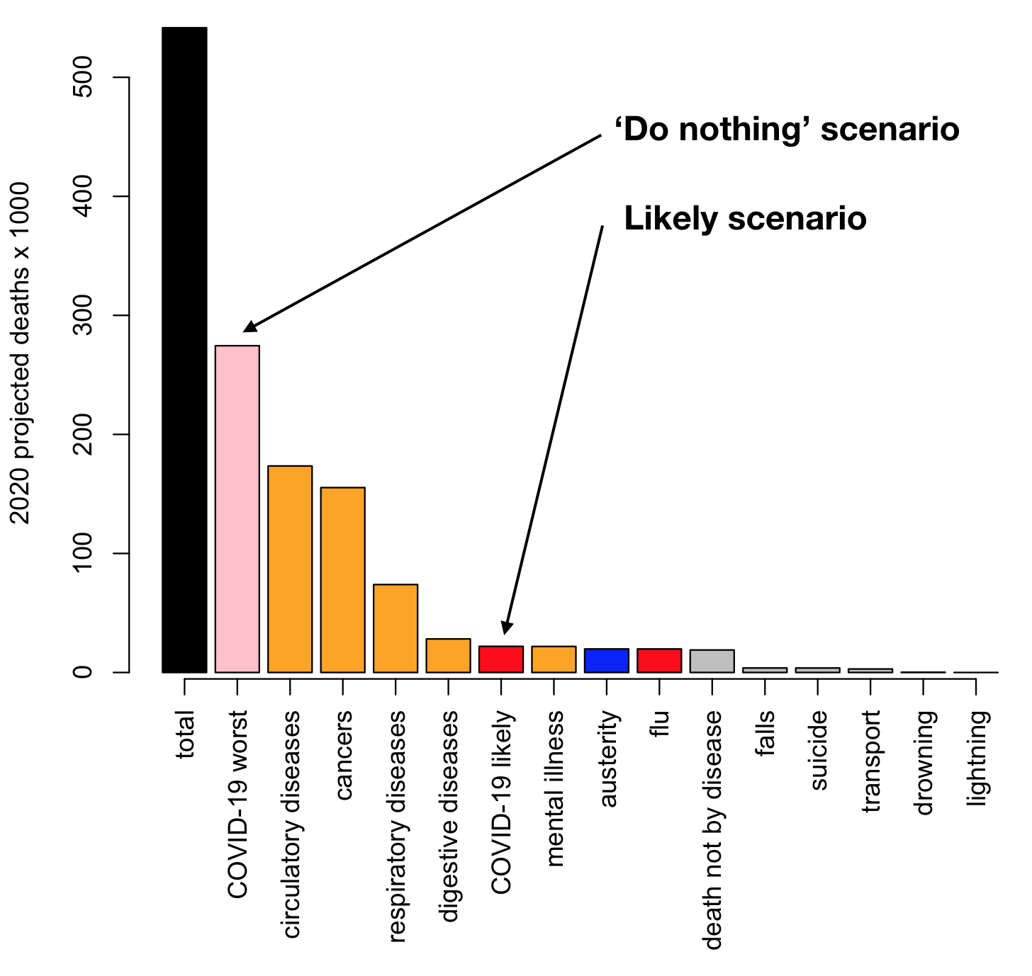
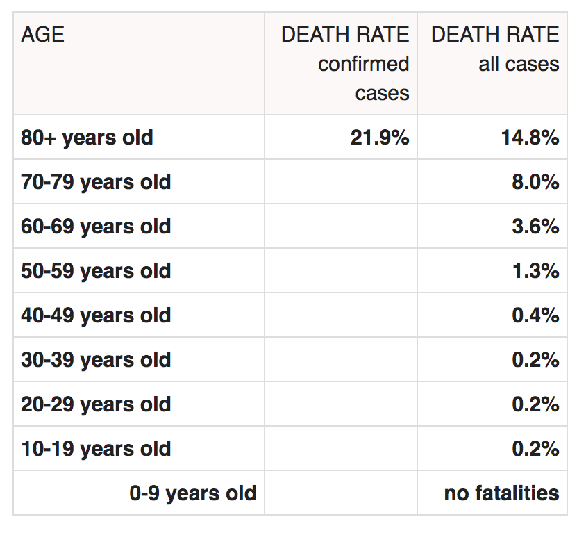
In order to have something to compare, I have calculated the ‘expected value’ for time lost due to COVID under actual versus worst case scenarios (e.g., no restrictions) for each age group. Just as this was calculated for the lottery ticket example above, this is the probability of dying within 28 days of a positive COVID test multiplied by the number of expected years each age group had left to lose. 

Table 1: UK actual COVID statistics split by 11 age groups. Cases from the office of national statistics, death statistics are widely available, e.g, here. COVID percentage increase is the percentage of normal deaths that is extra due to confirmed COVID deaths. Years lost is based on an expected age of 83 years (this is a simplistic model, and we should note, slightly underestimates years lost versus doing it thoroughly). Days per person (p/p) is the total years of life lost divided by the population within each age group.

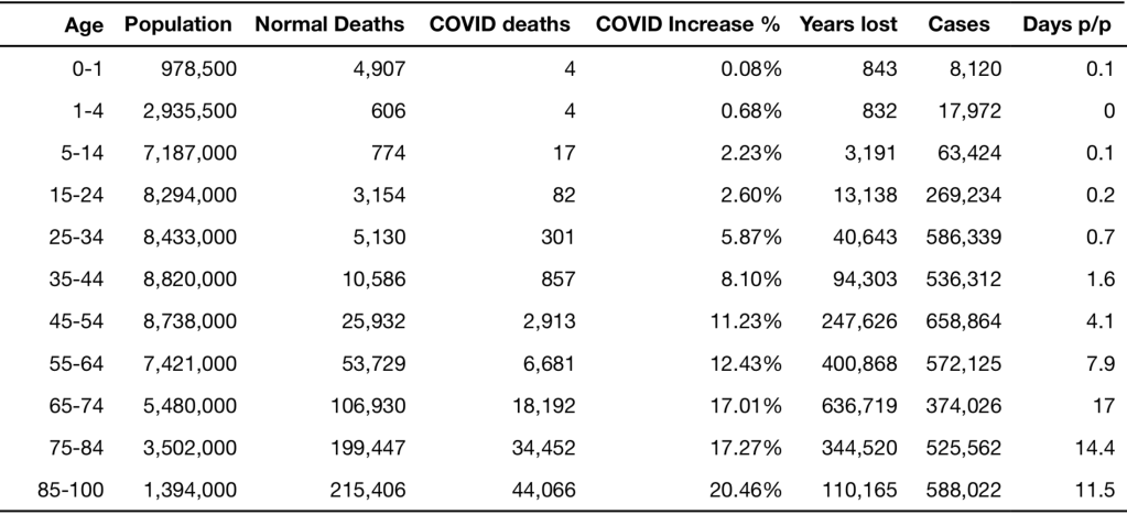
This is presented for eleven UK population age groups in Table 1. I initially chose to quantify these lockdown benefits using ‘years of life’ saved. A twenty year old who died of COVID might have lost 65 years of their life, but at the same time, the number of deaths in twenty year olds is 1 in 100,000. After starting the calculation I realised that the final numbers became tiny fractions and so it’s actually easier to organise these results using average days of life lost per person.

For those up to 35 years old, the number of days lost per person due to COVID deaths is comfortably less than one day (see the final column of Table 1). You could say even if lockdown had reduced the quality of their life by a single day in the whole year of 2020, more days of quality life had been lost due to lockdown than due to coronavirus. 

This average value for days of risk does increase with age: by 50, the expected loss is four days, then it becomes seventeen days at age 70. Counter intuitively, it is only eleven days above age 85 even though they have the highest mortality rate. This is because this group had fewer days remaining to live due to their increased age. So the greatest average loss of life is for the 65-75 years age group.

Days of life saved under best and worst case scenarios of not locking-down

These numbers so far (Table 1) are just actual loss of life whereas the dividend for lockdown is to save lives. The estimate I am using for number of lives lost in a hypothetical scenario of no lockdown or distancing is 250,000 deaths for the ‘best’ case, moving up to 500,000 for the ‘worst’ case.

It’s easy to convert to lives saved because we had roughly 100k deaths in the year since the pandemic began. We can just multiply by 2.5 and 5 respectively, subtracting the actual losses, to get number of days of life saved by lockdown.

Table 2. Days saved or lost per head of UK population, within age groups. These are calculated by multiplying the likelihood of the outcome by the number of days lost for that event, e.g, roughly twelve days due to acute sickness, or twelve weeks for long COVID aftereffects. Estimates are made for best and worst case scenarios of how many people would get ill if we didn’t lockdown, so this provides a range.

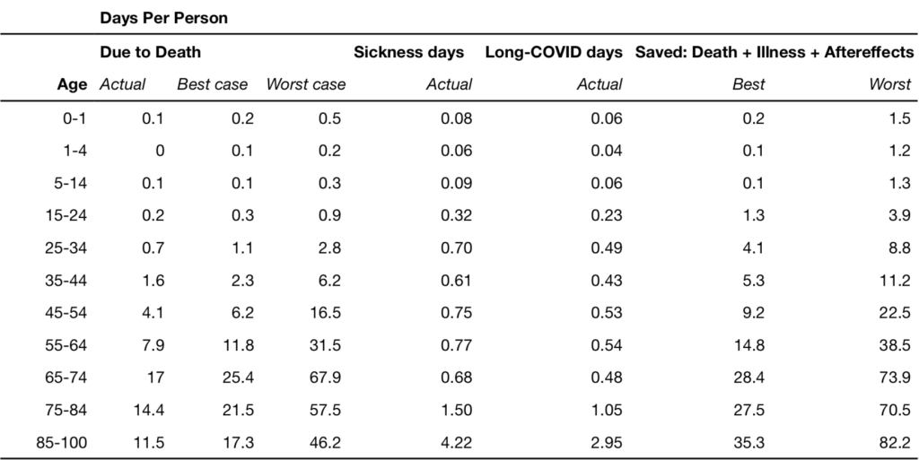
For 35 year olds in the best-case scenario lockdown has saved one day per person, or up to three days in the worst-case scenario. For 50 years olds we saved between six to sixteen days respectively; for 70 year olds between 25 to 68 days; and for 85+, between seventeen to 46 days of life were saved. For a ten year old the worst case scenario implies about one third of one day (eight hours) was saved. Note that these results are not days per year, or days per month, they are average days saved across a person’s whole lifetime.

Accounting for acute illness and long COVID

If we want to be fair about the negative consequences, we should probably include time being sick with COVID symptoms, and the effects of ‘long COVID‘. Similarly to the death risk I’ve multiplied the probability of these outcomes by the duration of symptoms within each age group. These results summarised by average days lost per person are presented in Table 2. There is a natural split at about 45 years of age where below this age, the risk under the worst-case scenario is small, at 11.2 days or less, while above this threshold the expected risk is substantial, between three to twelve weeks.

A worked example

Finally, we arrive at the summation of the total life-cost and the life-savings attributable to lockdown. My self-assessed cost of lockdown was ten days per month. This comes to 100 days in total for the last year if I admit to being able to live a little more normally during the two months of summer. In my age bracket’s worst-case scenario, the number of days of my life I’ve saved not dying of COVID, not having COVID, and not getting long-COVID is 11.2. So, by these calculations I’ve made a net loss of 89.8 quality days over the last twelve months by locking down. This was a poor ‘return on investment’ for me from a purely selfish point of view. I’ve only gotten back one tenth of the time I lost.

A raw deal for young people

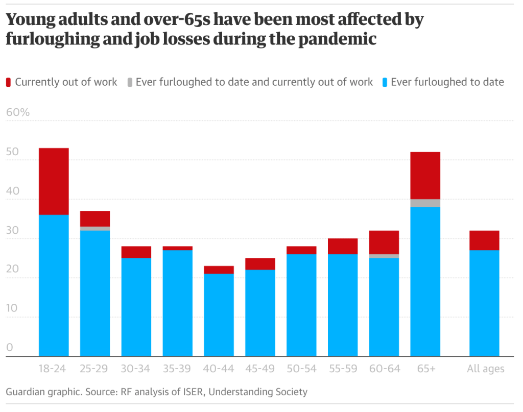
Returning to the question of how many days per month you would give up to avoid lockdown, for comparison we need to divide the lifetime number of risk days by the 12 months under lockdown/restrictions. The statistical equilibrium to balance these lost days comes to one day (or less) per month for under 45’s, or between two and seven days for over 45’s. So, if your number of lost quality days per month was below whichever of these thresholds applies to you, then you’ve made a good return on investment for lockdown. Conversely, if your number of days was above these thresholds, the sacrifice you have made over the last year was greater than the amount of standardised risk you avoided. If I were to imagine that I had survey results from these same age groups, I would be willing to bet that most people under 40 were net losers, and that for over 40’s lockdown has come out as much more of a personal benefit. This is a simplification, and furthermore, the dichotomy is not really surprising as age related risk has certainly always been part of the public discussion. But the numbers are pretty stark for young people. Only about 2% of youths who died this year died due to COVID. Meanwhile young people suffered significant disruption to their education, the early part of their careers, and mental health.

Older people aren’t the only vulnerable ones

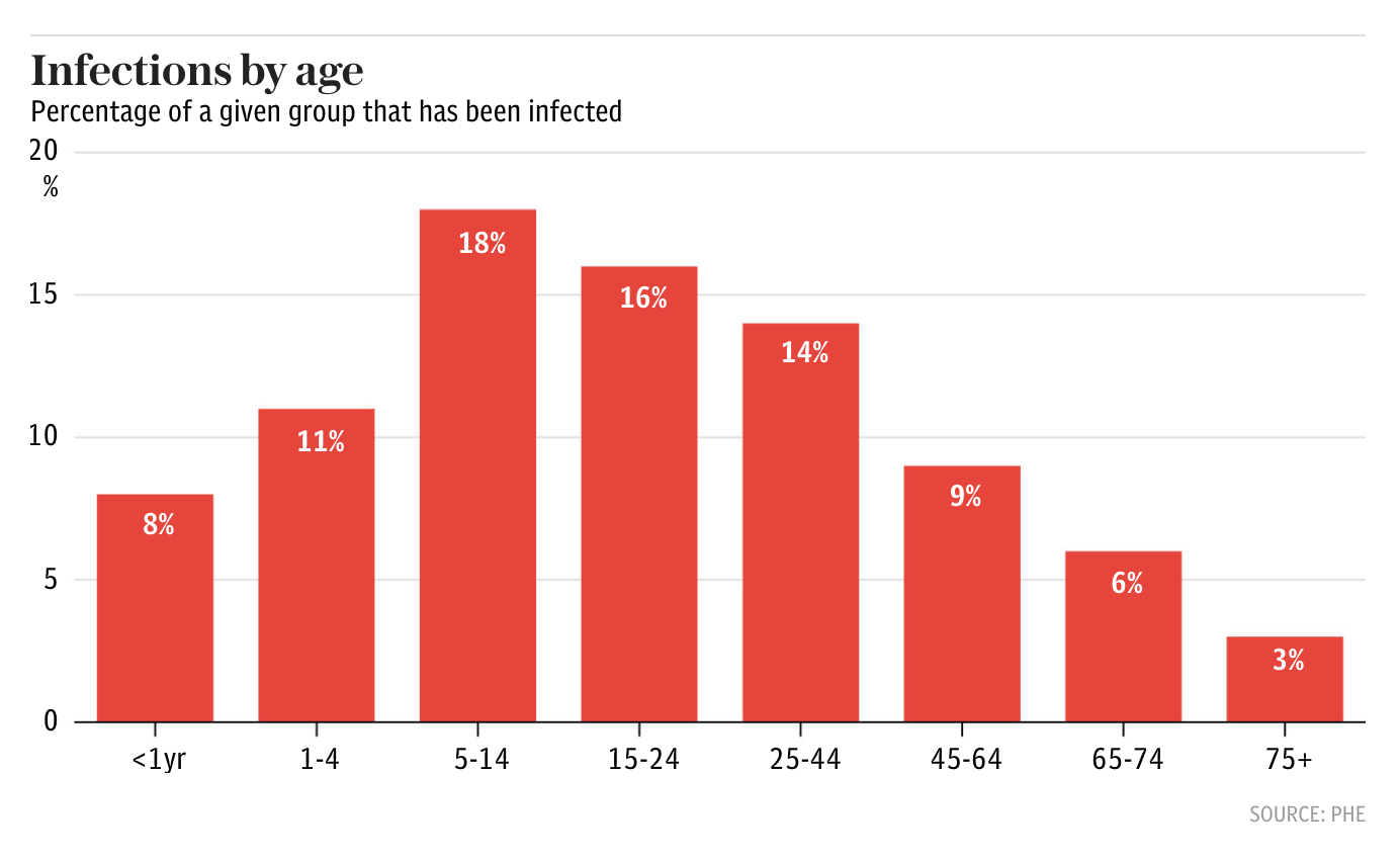
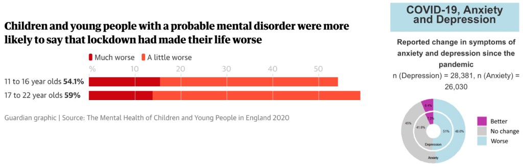
Lockdown has been hard on the 9 million people in the UK suffering from loneliness. Loneliness is a serious killer that has a global health detriment equivalent to smoking 15 cigarettes a day. Roughly 50% of people have had an increase in depressive or anxious symptoms (Figure 1). More than 2 million operations have been cancelled, which could lead to substantial numbers of lives lost due to neglect of other medical issues. Estimates are that 3 million cancer diagnoses might be delayed, and that a lockdown of six months would lead to an extra 173,540 years of life lost due to cancers that should have been caught earlier. More will suffer from mental health issues and those already suffering are reporting a greater reduction in their quality of life during lockdown. Predictions are that suicide will increase by 10%. There was a 50% increase in domestic violence helpline calls during the first lockdown in April.

Figure 1: Young people with existing mental health issues reported lockdown had made their life worse. Figure source (left). A survey of adults showed an increase in depressive symptoms for 51% of respondents, increase in anxiety for 49% of respondents, while 7% or less have fewer symptoms since the pandemic began. Figure source(right).

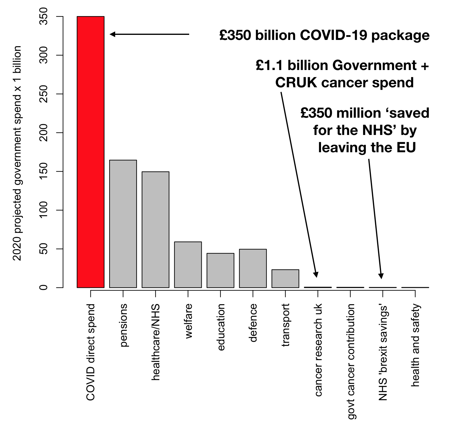
The cost of COVID for the government so far has been roughly £330 billion which is about £11,000 per working adult in the UK. The austerity applied by the UK government as a result of the 2008 financial crisis is estimated to have killed 131,000 people, which is more than COVID has killed to date. Unemployment is also a killer, with US figures suggesting that for every 1% increase in unemployment 37,000 people die (equivalent to 6,700 in the UK population). The unemployment rate during the crisis increased by about 1.5% but has recovered a little since vaccination began in 2021, but is still more than 1% worse than 2019.

Figure 2: Nearly 30% of workers were furloughed in the first half of 2020. There are 66,000 more 16-24 year olds out of work since the pandemic began. Figure source.

Don’t thank the young with vaccine passports

There is a lot rhetoric around in COVID times thanking essential workers and NHS staff. This is totally fair because these people are working hard and risking their own health to save lives and keep society functioning. But, I believe we should also be strongly aware of the sacrifices made by young people who undergo significant sanctions to their freedom, well being and long term financial prospects, despite having little personal risk due to COVID. Young adults were about 1000 times more likely to have lost their job than to have died of COVID in 2020. In the context of vaccine passports I think it will be crucial to delay any such measures until people of all ages have had a chance to be vaccinated. Otherwise this will be yet another kick in the teeth to the younger group who had the least to gain from all of the restrictions.

Of course, most young people will also have friends, family, colleagues and live in communities involving people of varying ages. So, it’s not all about self interest, but this individualistic comparison is rhetorical within this article.

It’s not all doom and gloom

There have been some positives to come out of this crisis, and not just for Amazon and Netflix. More people are exercising and riding bicycles. There have been reductions in some types of air pollutants lasting for months on end. Some people will have had time to take stock of their lives, up-skill, make self improvements, save money. People will almost certainly learn to be more grateful for the little things, and to cherish their friends and family. Events like this can also be a wake-up call and hasten society to seek positive changes. For such extraordinary events sometimes negative events can have an overall positive effect over the long term due to the systemic changes they bring about.

None of this calculus and comparison really matters

Analogous to the importance of proper risk-management in the financial world, expected return isn’t the only factor in choosing investments. Avoiding catastrophic outcomes should always be factored into your strategy.

I think if you really did the sums on an individual level lockdown has likely taken away more than it saved in terms of years lost and illness. But, this doesn’t mean that it was the wrong decision. Even if you wished to take the approach of ‘survival of the fittest’, it would not be pragmatically possible.

Unless this approach was taken unilaterally worldwide, your country would inevitably suffer impacts from restrictions on trade and travel made by other countries, and likely be subject to sanctions due to their rampant infection rate. Secondly, at its theoretical limit, such an abandonment of vulnerable individuals would never be morally tolerated by society.

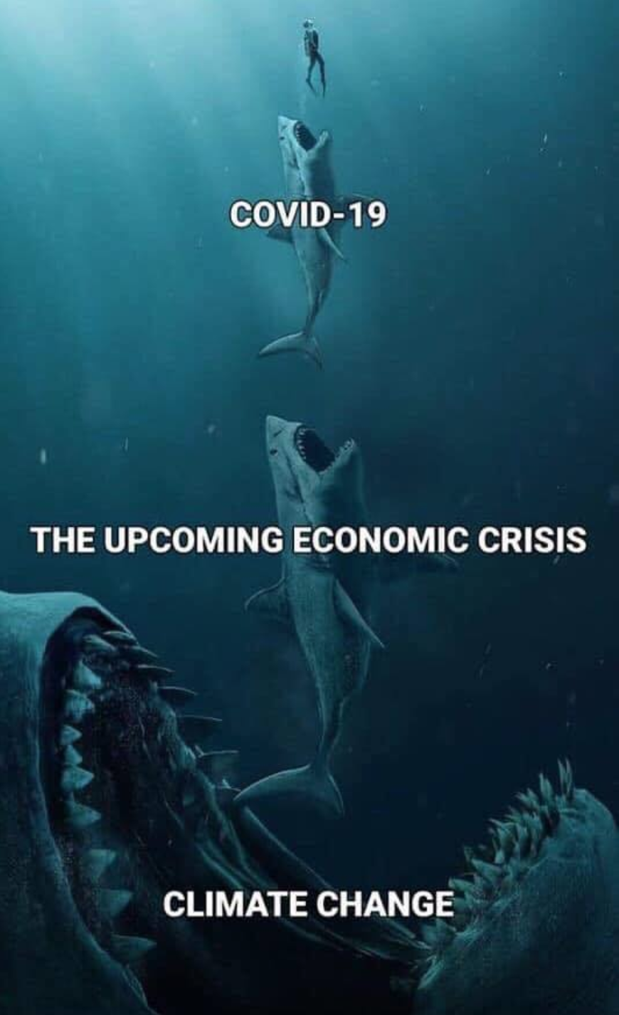
Most crucially, at the peak of the crisis we saw over 1,000 UK deaths per day and hospitals were at breaking point. Double, triple or quadruple this, and you would have a humanitarian disaster. Mass collections of bodies, the army patrolling the streets. A possible outcome of persisting with this approach would be a serious break down in essential services and public order, which could lead to loss of confidence in the government, loss of confidence in the economy, looting and even food shortages (Figure 3). Problems such as we have seen with lack of access to healthcare due to lockdown would be even worse under this scenario. Levels of day to day fear of the virus would be extreme if prevalence had reached four times the worst we have experienced so far.

It was simply never feasible to avoid restrictions which explains why no country took this free-for-all approach (at least not for the duration of the crisis). Countries in Asia and Australasia, who due to geopolitical luck and swift action, were able to lock down very early on and very effectively, were able to provide a much safer environment for their populations, and a much freer daily life, with relatively few restrictions versus Europe and America.

Figure 3: No-lockdown worst case scenario

The vaccines are very effective (importantly there was always a chance that they would not be) which has strongly vindicated this approach. You can retrospectively point fingers at herd immunity strategies proposed early on by Boris Johnson and Donald Trump. But, it may not have been possible for Europe and the USA to maintain strict enough control for an Australian-style approach to succeed. Those countries are much more highly connected to the rest of the world, more densely populated and were closer geographically to the epicentre(s) of the pandemic. Furthermore, the northern hemisphere was hit at a key time for infections to peak coincident with the typical flu-risk season (the colder months). Countries like Australia had more time to act, and as the crisis bloomed, were at the tail end of summer where people are less likely to become ill or pass on airborne viruses.

So what is your ROI on lockdown? I would propose it is the upholding of society as we know it! Regardless of your age we’ve lost a lot, but we’ve all come out ahead. The price of not locking down was always impossible.

Will summer save us? What can we learn from international COVID-19 league tables

I have been morbidly monitoring ‘worldometer’ coronavirus statistics since the start of the Italian outbreak like a daily weather report. By April, I couldn’t help but notice a stark divide between the northern and southern hemispheres in the number of COVID-19 deaths. It is hard not to be drawn to the idea that influenza has always been seasonal, and that the virus we are currently battling is just a particularly nasty variant. If that is true, perhaps we can hope that summer will coincide with a hiatus from COVID-19 for Europe and the United States. Australia and New Zealand have suffered very few deaths so far and this could be because the Coronavirus appeared at the tail end of summer which made containment a lot easier.

Given that it’s always easy to spot trends that confirm your personal biases I undertook a statistical analysis of the world-o-meter data to make sure I wasn’t just cherry picking some convenient examples and to also try to resolve the presence of counter examples for warm countries like Mexico and Brazil. This turned out to be a lot bigger task than I initially imagined, which required digging up more data to be able to address the question with sufficient context. In the end this task has comprised a broad establishment of the trends for differing death rates between countries, qualification of the drivers of death rate during lockdown, alongside an analysis of the drivers of flu seasonality. This led me to a prediction of what our coming summer will entail.

Seasonality of influenza

To set the scene, there are several plausible reasons why colds and flu are seasonal. I’ll list these briefly:

Vitamin D

The most talked about factor is Vitamin D which we absorb most easily through UV-B rays on days with a UV index above 3, or through eating fatty fish or certain mushrooms. There is a proven link between Vitamin D and immune system function. In a meta analysis of 11,321 people, supplementation reduced the chance of respiratory infections by 70% versus placebo, for those with Vitamin D deficiency, while general supplementation regardless of baseline levels provided a 12% reduction. Increased melatonin levels are associated with poorer absorption of Vitamin D, so could be a plausible contributing factor to higher levels of COVID-19 death within ethnic populations in the UK.

Crowding and air recirculation

In winter we spend more time indoors and the same air is more like to be recycled within relatively small spaces. The risk of contracting COVID-19 outdoors while observing social distancing is tiny, likely less than 1 in 1000 cases have been contracted outdoors. Large transmission events have included choir practices, restaurants and birthday parties, and it seems like the majority of COVID-19 transmission is through superspreader events.

Ideal conditions for virus survival

Common influenza can survive longer outside the body in cold dry weather. Optimal conditions for COVID-19 are likely close to 5 degrees Celsius within a humidity range of 0.6-1.0 kPa (dry), consistent with European temperatures as the outbreak hit. UV light is also being used for sterilisation against the virus but this only refers to dangerous UV-C light which is filtered out by the atmosphere and so is not related to seasonality. Notably these trends for viral abundance apply only to moderate latitudes. Viral epidemics in tropical and equatorial regions tend to correlate with high rainfall, while Influenza risk is similar all year round.

Seasonality of our immune system

You may have heard of circadian rhythms, which involve your sleep/wake cycle and hormonal changes with a 24-hour cycle. It is also believed that we have an equivalent yearly cycle stimulated by changes in daylight, akin to deciduous trees or hibernating animals. One theory of seasonal infection is that viruses are always present to some degree and that what changes is the effectiveness of our immune systems at keeping them at bay. Anyone who looks after plants or fish will know that if they become unhealthy, they will find some virus or fungus to catch – which didn’t suddenly materialise after visiting a bar with strange foliage.

The evolutionary origins of this fluctuation could have been to save energy during winter by down-regulating metabolism and immune function. I was involved in the analysis of longitudinal gene expression dataset showing that thousands of genes up- and down-regulate in an annual cycle, including key immune system components. The cycle is plotted below for large numbers of genes and you can see that the Australian cohort nicely inverts the trend of the Northern Hemisphere groups. Areas of extreme climate like Finland show a less distinct pattern because much of the year is so inhospitable that people experience an artificial ‘indoor’ season.

seasonal2

https://www.nature.com/articles/ncomms8000
Figure 1: Key graphs of clustered gene expression from the seasonality paper, showing the rise and fall of summer versus winter genes (c) and the difference between northern and southern hemispheres (d).

Other theories

It has been speculated that viruses could be spread long distances on wind currents but I don’t think this is seriously entertained any more. There have also been simulations using dynamics of normal social interaction and travel that could potentially introduce a seasonal pattern of outbreaks. Lastly, cold air can be abrasive to the throat. Localised inflammation due to extended breathing outside especially while exercising, may provide a breeding ground and entry point for respiratory infections.


Comparing countries on the global league table

Making comparisons using the global table of deaths is a lot more nuanced than meets the eye. Everyone who has done a statistics course has heard the expression ‘correlation is not causation’.  Examining differences between countries comes with a host of confounding variables, some of which (for my attempt to do this quickly in my spare time) could not be entered into, such as variation in death classification methodology, variations in national health systems, and comprehensiveness of record keeping between countries. Despite these challenges, I aimed to collect as much relevant data on potentially confounding variables for each country as possible, which included:

National data hypothesised to be correlated with viral spread

National data hypothesised to be correlated with viral seasonality

  • Northern Hemisphere located (yes/no)
  • Within the tropical/equatorial latitude range (yes/no)
  • Distance from the ‘prime latitude risk range’ of 30 to 50 degrees north
  • Fish and seafood consumption
  • Number of months since November, providing a good opportunity for Vitamin D absorption from sunlight (taken from a climatic averages database)
  • Vitamin D ‘score’ – without being able to directly measure vitamin D deficiency, I created a standardised score using the sum of scaled and weighted values from the prime latitude, seafood consumption, Northern Hemisphere location, and tropical/equatorial location.

NB: All distance metrics were calculated from latitudes/longitudes using the sp package.

Measuring COVID-19 national mortality

I considered three alternative dependent variables to encapsulate the extent of the problem within each nation. Each has its own strengths and weaknesses so my philosophy was to temper the interpretation by concentrating on analyses showing consistency between all three. All measures are scaled by population size.

Statistical Results

[NB: If you’re not into numbers and graphs, you might like to skip ahead to the interpretation]

Table 1 below shows the raw correlations between all of these variables and death rates, with yellow shading representing P values below 0.05 and orange shading showing P values significant after a correction for multiple comparisons. There are associations with nearly all of these predictors showing the complexity of the differences between countries. Indeed, there does seem to be some substance to correlations with latitude and Vitamin D. Furthermore, intuitively obvious variables like lockdown dates, globalisation, older populations and density also occur in expected directions. These tabulated correlations are Pearson R values, where larger positive correlations mean an increase in ‘row’ is associated with an increase in ‘column’, or negative correlations mean an increase in ‘row’ is associated with a decrease in ‘column’. The social globalisation index was the strongest raw correlate for peak death rate, percentage over 65 years was the strongest correlation for days above 1 death per million and prime latitude (30-50 degrees North) distance was the strongest correlate of total deaths.

This initial analysis sets the scene, allows discarding of any unrelated measures and selecting of the best representative amongst similar measures. But in order to make a proper comparison multiple linear regression will be used because it is able to assess relative contributions of each measure while controlling for all of the others. Correlations within these ‘predictor’ variables cause biases and problems, but by using iterative variable selection methods the aim is to try to minimise the confounding and try to establish some good representative models.

rawCorrelates
Table 1: Correlations between potential predictors (rows) and measures of COVID-19 deaths (columns). Orange = statistically significant P < (0.05 ÷ 57).

Multiple variable modelling

Rather than fill the page with regression coefficients and p-values, I’ll summarise the main trends uncovered through stepwise regression, show one representative model, and if anyone wants to see the remaining raw statistics I’m happy to email them (or the raw data if you’re that nerdy).

This model shows that the strongest predictor of total death rate, when looking at all variables combined, is the KOFG ‘social global index’. This variable encompasses individual travel, tourism, trade, and cultural globalisation. I’d included this measure because I felt it would be a good proxy for the connectedness between and within countries.

The high correlation supports the obvious consensus that social distancing and travel restrictions are effective ways to contain the virus, as these effectively reduce the concepts captured in this KOFG score.

Two other statistically significant key predictors which are very intuitively obvious are:

  1. The percentage of the population of each country living in urban areas.
  2. The number of days between the first case and lockdown within each country (if lockdown occurred at all), although notably correcting for multiple comparisons would occlude this effect.

Interestingly Belgium, with the highest death rate in Europe scores very high on globalisation as the EU headquarters and has one of the highest urban percentages globally. Belgian and English tourists are also the largest groups for ski tourism in Italy each winter.

Population density and percentage of the population over 65 were significant in some models, but in general became non-significant in the presence of stronger predictors.

The overall multiple R squared statistic of 53.6% for the model, shows that these measures can explain more than half of the variance (a statistical measure of the differences between countries death rates), which given the imprecision of some of the data and many hard-to-measure factors, is a quite impressive statistic.

Samples: 200 countries that had most of this data (missing replaced with mean)

Dependent Variable: totalDeaths

Predictors: VenetoDistance, VitaminDScore, lockDownMinusFirst, socialGlobalIndex, UrbanPercent

coeffWorld

Distance from the Italian Epicentre trumps seasonal predictors

The most striking effect of combining these variables rather than analysing separately is that the ‘distance from Veneto’ when combined with the measures of latitude, hemisphere and Vitamin D, tended to overpower those variables in its association. When ‘Veneto’ was removed, the Vitamin D variable was a strong predictor of death alongside globalisation and density measures. This renders the final model less interpretable because when predictors in a regression model are correlated, they can skew one another (‘multicollinearity’ problem). In fact, it can be seen in Table 2 below that our seasonal variables all have very significant correlations with the distance of each nation from the Italian outbreak of the epidemic. In Figure 2 it is clear that the bottom right corner (high death rate, close to Italy) has mostly red countries indicating Vitamin D deficiency and the top left (low death rate, far from Italy) has mostly blue countries indicating likely Vitamin D sufficiency. So, it is hard to distinguish whether the real driver is more strongly proximity based or seasonally based.

deathsVenetoVitd
Figure 2: Distance from North Italy versus Total death rate, where the country names are more RED where Vitamin D deficiency is likely to be more common. It is clear there is a strong correspondence between the distance measure and Vitamin D score.

venetoCor
Table 2: Confounding variables: Inter-correlations between seasonal predictors (rows) and distance / latitude variables (columns). Orange = statistically significant P < 0.0001.

Due to this confounding, I felt the questions of seasonal effects were not fully addressed by this analysis, so to provide further qualification, I sought to run a similar analysis on US states. The state statistics are easily obtainable and differences in policy, culture and geography should be less extreme than trying to pool every country in the world.

Analysis of US States

Variables chosen for analysis of US States for viral spread, seasonality and death rate

Examining the data from the United States showed a slight trend of more vitamin D exposure being associated with less deaths if weighted by state population, but not in the overall analysis in the table above. Once again, the strongest predictors were the distance from the outbreak epicentre and the equivalent measure of travel and connectedness (state GDP). Vitamin D exposure opportunity was not related to the total deaths within the model. Once again, there is a serious geographical confound because there is a 0.45 correlation between NYC distance and Vitamin D days. There is a further confound due to a moderate negative correlation between Vitamin D days and GDP (southern states are poorer). This confound is demonstrated in Figure 3 which is the equivalent United States version, for comparison with the international version in Figure 2. The bottom right quadrant (high death rate, close to New York) has mostly red cities indicating less days exposed to Vitamin D, while the top left quadrant (low death rate, far from New York) has more blue cities indicating more days of exposure to Vitamin D.

deathsNYvitD
Figure 3: Distance from New York versus Total death rate, where the state names are more RED where Vitamin D deficiency is likely to be more common. It is clear there is a strong corresponsondence between the distance measure and Vitamin D score.

Samples: 50 states (missing observations replaced with mean)

Dependent Variable: totalDeaths

Predictors: nycDistance, VitaminDDays, GDPperState

coeffUSA


Interpreting nation versus nation and state versus state analyses

After all of this analysis I still feel a little unrequited given the three-way entanglement of measurement for virus epicentre locations, latitude and the social/financial/global connectedness of the world. However, replication of the same trend within both datasets has led me to down-weight the impact of Vitamin D from my initial expectations. While it would be much better to have directly measured Vitamin D, this was not possible.

In terms of seasonality, there is some support for the alternative seasonal hypothesis that latitude-based associations might be the real driver, because correlations were stronger with latitude based measures than measures based on weather data. This would lend weight to the seasonal immunity hypothesis, which is driven by the annual light and warmth cycle, rather than UV-B exposure. So, the main insights supported by this analysis are:

  • Proximity, connectedness and social factors trump seasonal/climatic effects for COVID-19
  • Seasonal viral patterns may be driven more by cyclical immune system changes than by Vitamin D
  • Countries and states with high death rates are global and social hubs, in high risk latitudes, suggesting apportioning blame or comparison to other regions without accounting for these factors may be unfounded

Linking these findings with what we know about seasonal influenza

The strains of seasonal influenza are different every year with deaths in the UK ranging from the low thousands to numbers nearer 30,000 depending on how bad the strains in circulation are. It can almost always be characterised by a peak between December and March, with six months of regular weekly deaths, and six months of relatively little infection. The quoted R0 for the regular flu is 1.3 in contrast with the substantially higher R0 for SARS-CoV-2 which is thought to be higher than 3. 

In order to assess what reduction in R0 for the warmer months would be required to generate this cyclical peak for the regular flu, I used this epidemic simulator to create a curve using the known characteristics of influenza, to closely match the UK data for the 2011 flu season, which was a bad year but not extreme. A reduction of 50% of the R0 to 0.65 was sufficient to generate the seasonal pattern, suggesting that the driver of flu seasonality doesn’t need to eliminate the virus, it just needs to reduce contagion by half. Based on the meta-analysis reported above, population Vitamin D supplementation reduces illness occurrence by around 12%, which is not quite enough to explain the drop. To me this suggests that other factors, which are likely a mix of ideal viral conditions, seasonal immunity, more time spent indoors, and possibly herd immunity, must also contribute the reduction of virulence that nearly eliminates Influenza every summer. 

What can be expected for the summer ahead?

Lockdown and social distancing strategies seem to have reduced the R0 in the UK by around 80%. London and the south of England are faring slightly better than the north. However, the northeast does have less sunshine, more essential workers per head of population, and is typically worse affected by seasonal influenza than the south west.

excessWinterDeathsUK
Figure 4: Excess winter deaths by UK region. Source.

Given the outbreak occurred at a similar time to peak flu season we can assume that the R0 of around 3 is the maximum for this strain. If the historical seasonal factors provide similar protection against SARS-CoV-2, then we could imply that the summer R0 for uncontrolled COVID-19 would be around 1.50. This is still more virulent than a moderately bad flu, so this level of transmission would be out of control. It might suggest that whatever distancing measures we aim to take in summer, only need to be half as effective as those in winter to contain the virus.

We have had an atypically warm period of weather since lockdown and due to the ‘one exercise per day’ rule we have had an opportunity to replenish Vitamin D, or perhaps kickstart our summer immune system. Could some of our success in beating the virus be attributed to the weather rather than our social distancing? Even if so, it is likely that the majority of this 80% drop was due to lockdown and it is also likely that we can hope for additional benefit from seasonal factors.

The current situation in the UK

Daily deaths are still in the hundreds, but are definitely on the way dow, and we must always remember today’s deaths reflect the situation several weeks ago. You may also be surprised on the latest figures of how many people in the UK have already had the virus (many without knowing). Estimates suggest that 10% to 25% of the whole country have already been infected despite lockdown and social distancing. About 8% of people get the flu each year, but vaccinations against the flu are common and the regular flu is less contagious than COVID-19. Herd immunity requires a much greater proportion of the population to be immune to be effective, but if the 25% figure is true, this can help a little. It does seem despite initial fears and some anecdotal cases, that having COVID-19 does provide immunity against reinfection.

Containing the spread perfectly is impossible because essential services must continue to operate and these workers cannot help but spread tiny viral particles. Additionally, people must continue to visit supermarkets and pharmacies. The issue of civil disobedience of lockdown rules is probably a smaller issue than these former. Large percentages of essential workers (who make up 22% of the workforce) have been infected and some estimates say upwards of one third of NHS staff test positive for COVID-19, mostly asymptomatically. Large proportions of supermarket workers test positive, as do half of the soles of the shoes of NHS workers. 

There have also been some key updates on infection rate and mortality risk within age groups and the age differential is even more stark than first thought. Imperial College had the overall death rate as 5.1% for people in their 70s and 9.3% for over 80s. The latest analysis puts the death rate for the over-75s even higher at 16%, but has reduced estimates for all other ages: 1.8% for 64-75 year olds, 0.28% for 45-64 year olds, and 0.018% for 25-44 year olds. The infection rates are also much higher in the less at-risk age groups, which may relate to factors like viral load, greater general mobility, and could also reflect less caution with social distancing due to the lower perceived personal risk. Given such a low percentage of over 75’s have been infected, this population is still extremely vulnerable.

infectionsByAge

Conclusions

After all of that data trawling, the result is fairly consistent with circulating expert and government advice. COVID-19 is unlikely to remain contained this summer unless we maintain some level of social distancing.

Based on the progress we’ve made so far and the leg-up we should get from seasonal factors, I hope we can relax restrictions considerably for low risk age-groups during the peak of summer. Meanwhile taking care to continue careful sheltering and management of older and at-risk populations. It would likely be just a brief break before things once again ramp up at the approach of winter, when stronger restrictions will almost certainly need re-instigating. During this time, we will probably need to continue building surge capacity for beds, nurses, respirators, PPE, tracing and testing and prepare for the coming winter. Whether or not the government is willing to temporarily relax core lockdown restrictions is yet to be seen, but I believe this would be a fairly plausible scenario.

Meanwhile in the Southern Hemisphere countries like Australia and New Zealand are set to capitalise on their remoteness and should be able to maintain relative normalcy by border quarantine alone. Countries in South America are only likely to worsen, as the southernmost will be heading into winter and the equatorial epidemic will likely be unaffected by the seasons.


Context: COVID 19 is probably not as big a problem as you think

Nothing in my living memory has been as disruptive to everyday life as the measures being taken to halt the Coronavirus pandemic. And never in my life did I think would ever have any sympathy for any word uttered by Donald Trump, but maybe it’s the exception that proves the rule, when he has said: “We Can’t Have the Cure Be Worse Than the Problem”. Not that I’m advocating that we should listen to him for advice in this crisis, or that he’s managing things well in the USA, far from it! But he does address something that is awkward to talk about without crossing lines into the territory of causing widespread offence and concern. Namely that we cannot place an infinite value on human life, and that every resource allocated to COVID-19 cannot be spent elsewhere and will have long term consequences.

Screenshot 2020-04-06 13.59.57

Importance of context

Watching and reading the news can be a very bad way to form a clear picture of the scale and impact of a crisis. Generally the media will cherry pick all of the worst examples and impacts, which we subconsciously assume is representative rather than extreme information. Also we are acutely aware of the latest crises currently being covered, but forget about those that we as a collective have become bored with. But this doesn’t stop them from raging onward behind the scenes of our attention.

According to Anna Rosling Rönnlund, author of ‘Factfulness’, very few people have a clear idea of the numbers and percentages relating to fundamental aspects of the world and economy. We are given figures on the news every day for COVID-19 deaths, but without any perspective of how many deaths normally occur with the regular flu or from other causes.

At the moment (5th April) the UK is experiencing about 600 COVID deaths per day. Estimates from the government for the duration of the crisis, given that we have implemented social distancing, was that we might expect 20,000 deaths this year, while deaths if we hadn’t taken any measures may have reached 250,000. At a more typical time there are an average of 1,600 deaths in the UK per day, or 500,000 per year. The COVID-19 death rate each day currently comprises around one third of the daily average.

There is also a strong age effect with COVID-19 mortality risk, as there is across all types of death. If you are working age you have a roughly 999/1000 chance of surviving the next year. But if you are over 85, then there is a roughly 1 in 6 chance that you will die in a given year, even without COVID-19 in the picture. This is horrible to quantify obviously, but listening to the news you might feel that most funerals happening this week would be COVID-19-related, but not so.

deathTable

Importantly I would never advocate for ‘no restrictions’ because the predicted worst case scenario of 250,000 UK deaths is horrendous, and weeks of breathing difficulties must be an awful way to go, and the trauma for NHS staff would be intolerable. The best approach is definitely to act quickly to contain this problem. The potential 250,000 death toll figure comes from worst case-scenario assumptions of no action, and on our current trajectory that is extremely unlikely, but we should use this a baseline when comparing lockdown and social distancing to the effect of doing nothing and hoping for the best.

If we assume that the virus will be well contained by our social distancing and shutdown, then we would anticipate a similar number of people will die from COVID-19 (i.e., the estimate of 20,000) versus the number killed each year by the regular flu (it varies a lot depending on strains, but the 4 year average from 2015-2018 was 18,000 per year). This is also similar to an estimate of how many people were killed due to indirect effects of austerity from 2012-2019 due to the financial crisis (131,000 total), or similar to the number of people killed by accidents, like drowning, poisoning, falls, car crashes, etc (18,000 per year).

DeathsPlotAnnot

The cost of the shutdown

In order to alleviate and anticipate the economic fallout of the world wide shutdown the government has prepared a £350 billion package to pay wages and prop up businesses, which is only part of the price we’ll pay as an entire economy for this intervention over the years to come. If we look at the money spent in 2020 on cancer research, this is roughly 300 times less, despite that it is likely that five times more people this year (at least) will die of cancer than COVID-19. To be fair we should look at lives saved rather than lost, so the 5 year survival rate across all cancers is about 70% (so even more lives are saved than lost through treating cancer: ~150,000 deaths in the graph). Similarly we spend about £330 million per year on health and safety. While accidents cause several thousand workplace deaths annually, health and safety regulations likely save ten times more lives than this. We as a collective complain endlessly about money wasted on welfare, but £59 billion annually pales in comparison to this initial COVID-19 spend. *

Screenshot 2020-04-06 17.45.04

The cost of a year of life

These are rough figures, but clearly there is a trend here that in monetary terms, we are valuing the prevention of deaths due to COVID-19 much higher than deaths due to other causes. Dr Malcom Kendrick, makes this point in great detail in this article. He uses a metric invented by the National Institute for Health and Care Excellence (NICE) called a QALY which represents one year at full quality of life. To make decisions on funding and healthcare, NICE values a QALY at £30,000, i.e, one year of healthy life. Importantly with COVID, it disproportionately affects older people, and the older you are the worse it is. As brutal as it sounds, the older you are, the less years of quality life you have left. The average age of death for COVID-19 in Italy seems to be about 78.5. On average COVID-19 deaths are reducing life spans by only four years. Assuming that in comparison to the no-treatment scenario we are saving 250,000 lives, then we have spent nearly £400,000 per year of quality life retained. Which by the NICE funding criteria of £30,000 per year, would never be considered as a viable tradeoff, in the context of all the other pressing problems that money could be used to address.

Further economic repercussions

The £350 billion government package isn’t the only economic burden that COVID-19 will leave in its wake. We all know people who have lost their jobs, we know small businesses that will fold, and have taken pay cuts or furlough. Freelancers and those working for cash aren’t compensated. Furthermore, an economic downturn other than causing stress and poverty, has real and fatal health consequences, with the after effects of the last financial crisis believed to have killed 131,000 so far.

Many of the staples we have come to expect, like air travel, could be affected for a long time, I have heard that commercial air travel may not normalise for up to two years. This could be great for the environment, but terrible for trade, tourism and long distance families and relationships. When something so fundamental to the economy as the aviation industry is under such pressure, how many businesses will fail, and how much economic chaos and hardship will ensue, potentially even in industries we’d not have expected? Globalisation leads to more efficient business models and more and more businesses must be operating on tight margins to compete, and cannot cushion the blow of months of lost income.

There is a lot of uncertainty in how to proceed

Many of the parameters of what we are dealing with are unknown and only becoming clearer with more time. We don’t know how many asymptomatic people there are, we don’t know the exact ways in which the disease can be transmitted, we don’t know exactly which containment strategies are worthwhile, we don’t know how the virus will mutate, whether different environments and genetic sub-strains in other countries will lead to different lethality, we don’t know how long immunity will last after recovery, and we don’t know what the effect will be of impending (hopefully) warmer weather in the northern hemisphere.

Australia has restrictions at a similar level to the UK, and may be further ‘behind’ starting their curve, but perhaps not, as the rates there seem to be plateauing. Colds and flus are generally very seasonal, because people have a superior immune system during the summer months, we spend less time indoors breathing each others’ air, and our respiratory tracts are less inflamed when air temperatures are warmer. It’s possible that despite all the social media panic about people spending too long exercising on the warmer days lately, that exercise and sunshine could be building resilience against becoming unwell. Lockdown will be associated with increased domestic violence, divorce and mental health issues. It is possible that a herd-immunity strategy may have been better for the UK in the long run, but this is a very risky approach that few would recommend because if any assumptions are wrong it could have been catastrophic. 

I’m sure that governments are conducting cost-benefit analyses and strategising towards the best balance of economic protection whilst saving as many lives as possible. However, I think that the public needs to be more tolerant to the consideration of economic factors, to consider the scale of the ‘cure’ in line with the scale of the risk. We must be open to the government taking strong measures to prevent collapse, understanding tradeoffs between eventual relaxation of restrictions despite the inevitable COVID-19 risk of a second wave.

Screenshot 2020-04-06 17.08.03

The mortality risk in this situation is very heavily skewed towards people over 65, and especially over 75, however the burden of the economic problem is very much skewed towards working age people. Something that could be considered as an interim step could be to allow employed people to work, or children to attend school, but the non working or retired population should stay in lockdown for longer, given they are the most at risk, and their continued lockdown causes the least economic damage. There could also be special dispensation for at-risk people of working age to continue isolation with state subsidy.

Failing this, we should at least sponsor an antibody test that allows those who’ve had the virus (symptomatically or not) to resume work, although this seems quite difficult to do. But strengthening the current shutdown, or maintaining the current lockdown for months and months as some commentators are suggesting, seems to be economic suicide, and wildly out of balance with the tradeoffs tolerated for other common causes of death.

A search for balance and rationality in the bushfire debate

I’ve been seeing social media posts seeking a ‘rational voice’ in the Australian bushfire debate about ‘who is to blame’. The left attacks Scott Morrison, the right blames ‘greenies’ for prevention of back burning. There always seem to be two sides to a debate and intensifying tribalism can leave some onlookers seeking to take a step back and mediate, to try to pacify an uncomfortable emotional environment.

It seems an ever increasing trend in public discourse on Australian politics, once a debate starts to crescendo to say we need rationality, we need to avoid ‘class war’ and that the truth is somewhere in between the opposing political tribes. Traditionally this was what we were taught in school and was fairly accurate at the time. This was before the ‘Cambridge Analytica‘ era of spin, fake news and routine deployment of disinformation as a political weapon.

Outright falsities have been pedalled on both sides, sometimes for profit (e.g, claims that firefighter Paul Parker who cursed Scott Morrison and then collapsed was sacked for dissent). However, voices defending Scott Morrison are relying almost entirely on misinformation, generally pitched without any credible evidence or eloquence, not leaving much scope for a ‘rational’, happy middle ground. Placing blame on ‘greenies’ for preventing pre-emptive hazard reduction burning has been routine during bushfires for decades (see this article from 2013), but the facts do not support this view. This is not ludicrous like Trump blaming Californian fires of 2018 on the governor preventing firefighters from accessing water, but the Australian conservatives are reading from the same playbook. A new conspiracy theory emerging is that the unique scale of this fire catastrophe is due to ‘serial arson‘. There are substantial forces who have decided to permeate such rumours using digital scammery, with troves of ‘fake news’ posts generated by bots on twitter. This serves to sew doubt and confusion where the situation is actually quite clear in some key respects.

Thousands of bushfires start in Australia every year with historical causes of ignition including: 13% confirmed arson, 37% potential arson, 35% accidents involving campfires, back-burning and machinery, with only 6% typically due to lightning strikes. These ignitions are inevitable but the unprecedented scale of burn this year is due to extreme dryness during winter and intense heat that began in spring. The dryness is due to an exacerbation of the Indian Ocean Dipole climate phenomenon, which occurs more often now than it did historically, due to global warming. This causes more rain in the western ocean, and less on the eastern side (Australia). So the bush in 2019 – even in winter – was bone dry and ready to ignite, and spread like … wildfire.

To add to this, 2019 has been the hottest and driest year on record, and with a warm dry winter, experts warned and feared a long and harsh bushfire season. This warning was not a lucky guess by some fringe group that seemed prescient only in hindsight. The risk was well known and understood in the mainstream of fire strategy and reported in popular media. Fire chiefs lobbied early in 2019 for measures including Australia’s own fleet of water bombing planes. The opposition, the Australian Labour Party included such measures in their election promises.

Scott Morrison is not to blame personally for climate change or the increasing frequency of an Indian Ocean Dipole. But much of his action and inaction before and after the fires has been far below the standards we should expect from a Prime minister (shockingly Alan Jones agrees!). He certainly has done everything in his power to prevent any progress on tackling climate change, including ousting his former party leader due to differences of opinion on climate change and same sex marriage. Technically, his personal influence as national leader for 16 months on the overall warming of the earth would be a small fraction of 1%.

Scott Morrison is to blame for failing to meet with fire chiefs or provide additional resources to the firefighting effort in time for them to be effective. Why would he act so contrary to the nation’s interest? Because any admission of such a risk, or of the existence of climate change is ‘off message‘, unpopular with his base, his party, and counter to the interests of his fossil fuel donors. As the crisis began he sought to divert attention, change the subject, arrested peaceful protesters, and reduced his opportunity for leadership and response by taking an inopportune holiday. Whilst the need for a break from work is understandable, the leaders of countries have different obligations to the average worker.

Scott Morrison’s ties to the coal lobby are well established, and for the remainder of his time in power he will most likely do everything in his power to continue to hamper national and global efforts to tackle climate change. He will hope that Australia forgets it’s rage and anger, and that this passion turns to numbness before the next election. And he will pray that his current intense unpopularity does not provoke his party to attempt yet another ‘spill’.

It is hard to know how much of a better outcome would have been possible had more fire fighting resources been allocated sooner. However, the response of Scott Morrison to downplay, disappear, disinform and deny is unquestionably unstatesmanlike and categorically not what we want in a national leader. A catastrophe like this inevitably raises awareness of issues surrounding climate change because it brings to light real physical consequences of climate change, much more fathomable than abstract concepts like a mean temperature increase of 1 degree (which sounds on face value unremarkable). Given that the Liberal party have been climate change deniers and skeptics for decades, it is absolutely in their interest to do everything possible to create division and confusion to distract from the cause of the unprecedented proliferation of fires this season. Links with climate change are absolutely undeniable, and you will find no credible source anywhere saying anything emphatically contrary. I only hope that the Australian public, and the rest of the world looking on in horror, will not forget this and no longer stand by and allow public discourse to tolerate giving ‘fair and rational’ credence to points of view that do not deserve our attention whatsoever.

PS: I have included credible references for nearly all of my claims, from reputable sources, including a top tier scientific journal, international and local left and right leaning publications.